HOW TO WEAVE DARING, OPTIMISTIC HUES
LIKE VIVA MAGENTA INTO YOUR NEXT PROJECT
We’re still taking inventory of the changes the pandemic years brought to our lives.
We set up (or reinhabited) home offices. We spent hours on-screen in Zoom calls with clients and colleagues. We found new ways to work together, relying on our screens and internet connections.
When we weren’t busy with work, our gaze turned to our palms: TikTok dances, cooking videos, and the latest news updates swirled. We spent as much as 80 percent more time on screens during quarantine. While some of us found the connection we craved, 40 percent of us often, or at least sometimes felt worn out from spending so much time on video calls.
In an effort to find balance, we spent about 30 percent more time outside. Homeowners spent unprecedented amounts on outdoor living during the pandemic. At the same time, more than a third of us tried to cut back on the time we spent on screens.
In selecting their Color of the Year for 2023, Pantone put a finger on that tension—and the potential for harmony—between two worlds: our digital lives and the natural world.
18-1750 Viva Magenta emerged as this year’s pick. The color is rich, warm, and fierce, like our favorite places in the great outdoors; it’s also optimistic and bold, like the open horizons of our lives online. Pantone called it a “brave and fearless, animated red that encourages experimentation and self-expression without restraint.”
Bold-yet-balanced colors like Viva Magenta, along with its associated hues, have always been celebrated at S. Harris, where we put self-expression and experimentation at the core of everything we offer.
We’ve thumbed through our collections and picked our favorite ways to bring big, bold colors like Viva Magenta into a space, whether it’s in your own home or as part of that next big project.

GO BIG AND GO HOME
To use the full power of Viva Magenta, go with a large upholstered piece or bold window covering in a space—or, in the full spirit of the color, both.
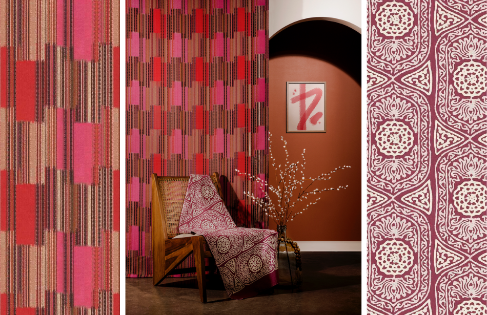
Our Chatai fabric, shown above in Flame as window covering, is inspired by reed mats made from a weaving technique called plaiting. The multicolor geometric stripe woven with Zari, a yarn typically used in traditional Indian garments, fluctuates in color throughout the fabric.
Bhavana, draped over the chair in Persimmon, is inspired by a Bhutanese headdress, in which each element has meaning and purpose.
Both Chatai and Bhavana debuted as part of the Orejen collection, a partnership between The Black Artists + Design Guild and S. Harris, and can pair to create dazzling color play.
And then there's the subtle sheen finish of our Wool Satin, available in 20 fresh colorways. Wool Satin brings an element of cozy glam to any interior. The Poppy colorway, with its rich hue reminiscent of tropical flora and berries, would energize anyone inspired by Viva Magenta.
A finer-print counterpart to our Piston pattern, Piston Mini packs a small-but-mighty punch with vivid color and rounded geometry. The Pink Sun colorway undulates from light pink to fuschia to plum, all in the family tree of Viva Magenta. Rendered in 100-percent cotton, we love this fabric for bedding and draperies.
Bold, graphic, and luxurious. Geometrica, our digitally printed geometric cut velvet, is aptly named, and the Pink Moonstone colorway tucks in plenty of that magenta mood, as well as vivid pinks, blues, and greens.
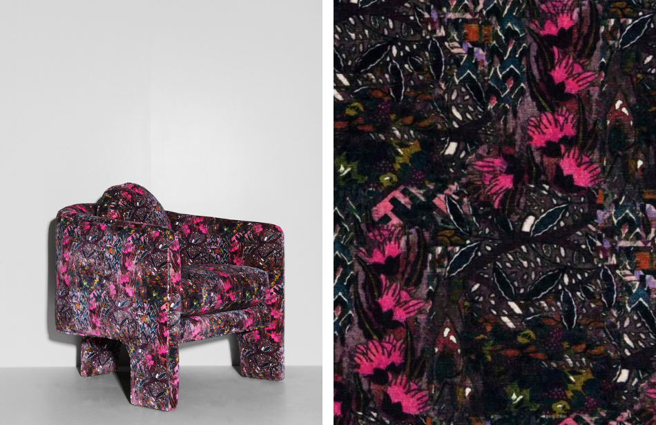
A printed botanical velvet, Borneo is named after the third-largest island on earth, which is home to one of the oldest rainforests in the world. This uber-luxe fabric in Berry Lush, with festive bursts of magenta, brings a bright pop of color and pattern—plus, surprise, it’s as durable as it is beautiful. We love putting this contemporary velvet floral in high-traffic areas.
Nothing embodies the spirit of the intrepid Viva Magenta quite like sumptuous, oversized sofas wrapped in richly hued, low-pile cut velvet. Designer Tracy Huntington specified India Velvet in Berry Lush for this space, “for its unique look and contrast between the bright berry color and our blue textured wallpaper.”

POPS AND WINKS
Going big-and-bold with Viva Magenta is invigorating, but we love how the color pops in neutral, laid-back spaces, too.
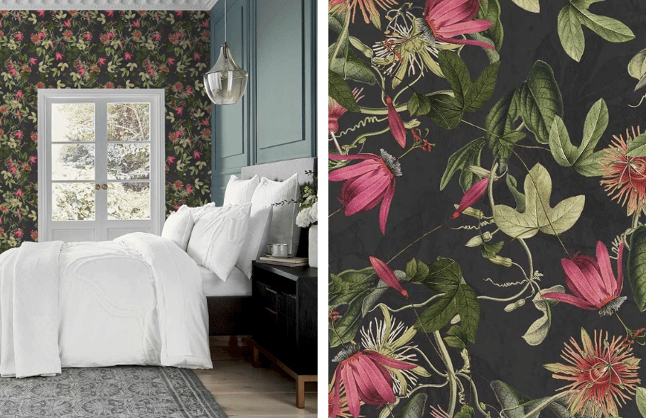
Case in point: The Bountiful Wallcovering, part of our collaboration with Ted Baker, is a fresh floral that pairs a neutral ground with bright pops of pink, fuschia, and crimson. We love this wallcovering in the Black colorway, where drama and flora meet tranquility, bringing just the right touch of the unexpected to this easy, breezy bedroom.
Trim remains a reliable way to add pops of color to a space.
Our 4-inch Modern Lace trim stuns in Lipstain, which is big on those Viva Magenta vibes. The color is decadent, and the embroidered design atop a wash of color creates a graphic-yet-delicate interpretation of a handmade contemporary lace.

What do you think of this year’s Pantone Color of the Year, and how are you weaving it into your projects? We’d love to hear from you—tag us on social to join the conversation. #sharris
Header Image: Ariene Bethea for House Beautiful Whole Home 2022
S. Harris offers distinctive textiles designed to elevate the art of interior design. Our collections are born from a passion for unique materials, innovative techniques, and a timeless approach to style. With a legacy of artistry, our creations are designed to inspire spaces that resonate with individuality. Explore our collections and collaborations at sharris.com.
Subscribe to our Blog
Copyright © 2020 S. Harris. All rights reserved.
