THE PROCESS
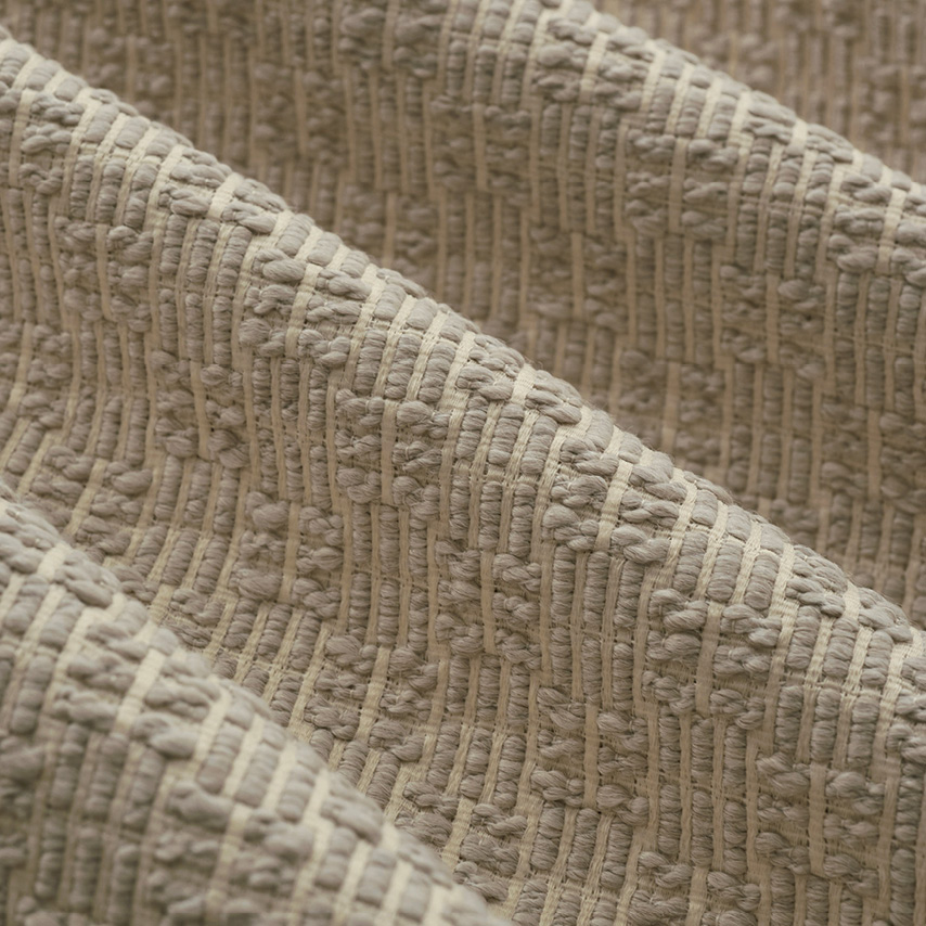
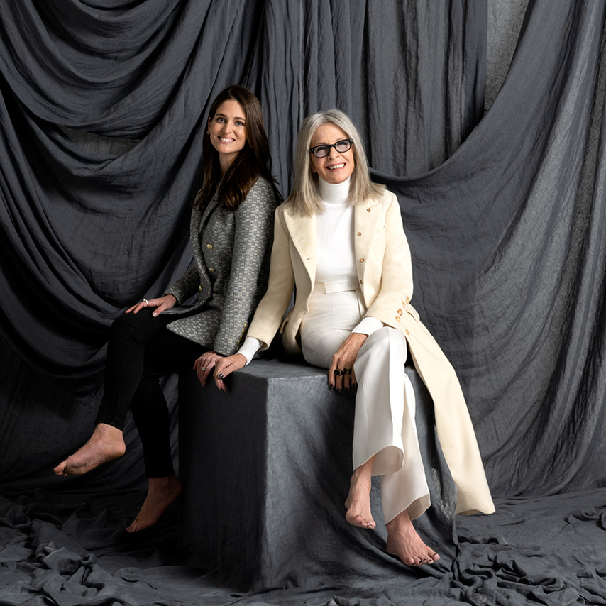
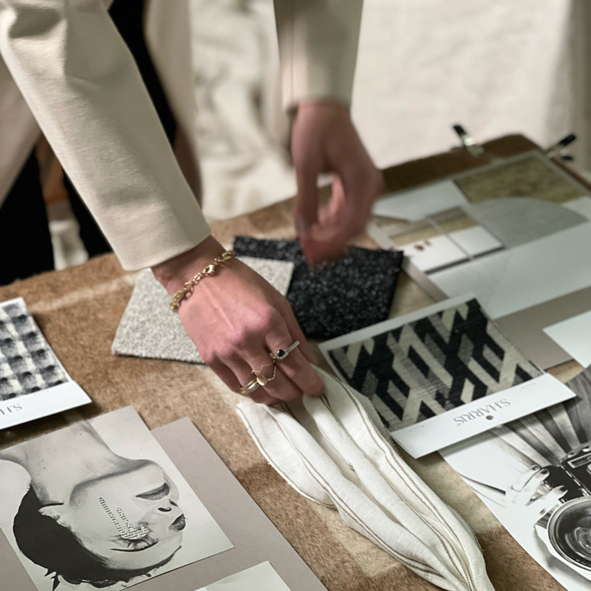
The creative process was all about how we could get each other excited about textiles. I would send her fabric ideas and she would show me old photos of what she loved and color palettes that she was interested in. It all ranged in a series of warm and cool neutrals, from light to dark, and she was really excited by the idea of bringing texture in to speak to the collection and showcase how one could feed off of the other in a very unique and simple way.
IMAGE BY JESSE STONE

THE PALETTE
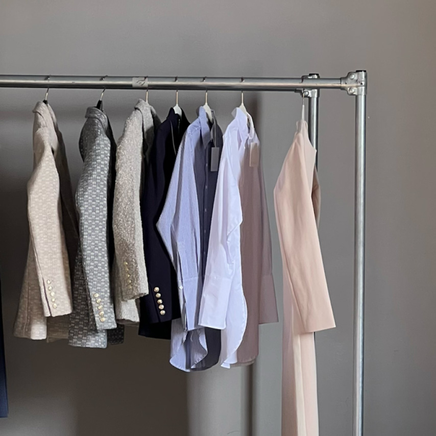
What attracted me to this idea of contrasting monochromatic colors is how you can create fabrics in multihued designs that bridge from one color to another. When you go from white to off- white and dusty taupes into more warm linen colors, there’s a lot of bridge tones that bring out color when you’re looking at the collection as a whole, and it’s exciting to see the variation of shades that work themselves through the whole collection and inspires the overall palette.
IMAGE BY JESSE BRATTER

